

Do you remember the button you clicked on a website that was impossible to resist?
Perhaps someone did well with that call-to-action button.
You’re reading this piece of content because you googled “call-to-action buttons” or “call to action examples” or found this article on social media and want to know what the heck is a call-to-action?
Buckle up because I’ve got this covered for you. Not only will I explain a call-to-action button, but I’ll also dig deeper and share some examples with you.
The next time you’d be submitting an online form or shopping online, you may recall this piece of content.
This article will come handy if you’re about to start a blog, an e-commerce startup, or a business website.
The reason is that a call-to-action is an essential web element that drives engagement, conversion, and clickability. The attention span of the website visitor is shrinking for many reasons. Therefore, we need a subtle element that does the job for us.
I’d like to put forward some call-to-action examples so that we could decode some of the essentials of making perfect CTA buttons.
Perhaps you want to increase your click-through rate (CTR) whether you’re a blogger or a startup or a digital marketing agency, let’s admit, we all want more clicks and lead generation.
Before we jump to the call-to-action examples, I want to take a minute and explain to you the basics.
What’s a Call-to-Action?
A call-to-action is a text or graphic element that takes a visitor to the next stage once the required action is taken.
The call-to-action buttons are an integral part of the online subscriptions, surveys, and opt-in forms. They often entice visitors to click-through and move forward.
The clickability determines how good a call-to-action is.
Have you seen blog subscription boxes that ask for your name and email address?
There is always a button underneath the name and email address fields that says “Get Updates” or “Subscribe,” which proceeds the action. If you haven’t learned about call-to-action (CTA) before, don’t worry because, by the end of this article, you’d be able to completely play around with your CTA buttons.
Why is a Call-to-Action so Important?
Some of you might wonder why call-to-action buttons are significant in blogging, digital marketing, and e-commerce.
Chances are, you’ve seen a lot of companies, content marketers, and bloggers mumbling about call-to-action buttons from time to time. The fundamental idea of a call-to-action is to communicate well and send a clear message across.
Therefore, people who know the importance of CTAs, they want to seize this opportunity of getting the attention of the audience because a well-designed call-to-action sometimes lands you a new customer or a subscriber.
Moreover, the following are the five reasons why call-to-action buttons are important:
- They impact the click-through rate anywhere you use them — website, blog, landing pages, or opt-in forms. However, the relevance of the CTA with the copy of the page plays a huge role in the conversion; if you pull this off, the results would be great.
- They bring the attention of the readers if used properly. It’s necessary to make compelling call-to-action buttons so that visitors could stop by and click on the CTA. The common call-to-action buttons such as “Get Updates” or “Join the List” don’t work anymore.
- They have a design element in them, which can’t be ignored. Besides the text-part of the call-to-action button, things that matter would be size, shape, and color of the CTA. You have to put some effort into designing the CTAs that attract people to click through.
- They give visitors a direction. It’s true that if you don’t quickly engage the visitors, they’re likely to slip away in seconds. This is why design, colors, and page elements are crucial to website conversion. When a visitor is scrolling through the page and look at the call-to-action button, the button guides the visitor further to take a specific action.
- They increase the lead generation on websites. When you’re struggling to get sales or email subscribers, the call-to-action button could turn out to be a game changer. Maybe the previous CTAs weren’t defining your narrative and changing the CTA could turn things around for you. There are various factors that influence the lead generation process, and a call-to-action is one of them.
Now let’s transition towards some examples of various call-to-action buttons and discuss each one of them to elaborate on the point of this article. It’s obvious that a good call-to-action button is a combination of an attractive message, color scheme, design element, and the size of the button.
Let’s analyze following call-to-action examples and find out what they’re doing great or what’s wrong with some of these CTA buttons on these websites so that you could fix yours immediately:
1. Viralwoot
Call-to-action: TRY VIRALWOOT TODAY

Let’s dissect the first example of the call-to-action button. Viralwoot is a social media scheduling tool for Instagram and Pinterest. The opt-in form you’re seeing in the screenshot represents the free trial account signup form on the homepage of Viralwoot.
They’ve made a fairly large call-to-action button which quickly grabs the attention.
However, the text size could have been bigger, but it still does the job. The orange color of the CTA is making all the difference here. It easily stands out on a dark gray background.
A lot of people use green color for call-to-action buttons; one of the reasons is that it attracts visitors because mostly it’s the only green element on the page.
There is nothing wrong with the orange color or any other color for a CTA button as long as it’s clearly visible and grabbing the attention.
Moreover, the call-to-action button is accompanied by different types of text lines, which, of course, are helping in the visitors’ engagement. All in all, it’s a good effort.
2. Viraltag
Call-to-action: Try for free

Viraltag is a popular social media scheduling tool that helps bloggers, businesses, and marketers schedule social media posts on Pinterest, Instagram, Twitter, Facebook, and LinkedIn. Let’s take a look at their website’s screenshot.
They have pink and black colors in their branding so it’s understandable why they used pink call-to-action buttons above the fold.
Viraltag has two call-to-action buttons on the top and one at the bottom of the website. As far as clickability is concerned, the two at the top are obviously more important than any other button on the website.
The CTA texts, however, aren’t impressive because both “Sign up” and “Try for free” are quite mundane. They don’t give visitors an emotional nudge to take some action.
The color scheme doesn’t have any issue because it goes perfect with their website theme. However, they could have done better with their call-to-action text-parts.
These things look very simple, which is why many brands and bloggers don’t pay much attention to them. It’s fascinating to understand how these tiny things affect the behaviors of the website visitors.
3. SocialPilot
Call-to-actions: Start Your Free Trial, Check Our Plans

SocialPilot is another fantastic social media management and scheduling tool.
If you go through their homepage, you’ll see two call-to-action buttons which are above the fold. Plus, there is a third one on the top menu bar.
The best thing about SocialPilot is that they’re using the real estate perfectly. They could have made just a one call-to-action button which says “Start Your Free Trial” but they came up with two instead.
The other CTA button which says “Check Our Plans” is not only increasing the click-through rate, but it would also be impacting the conversion rate.
Maybe some visitors would like to see the pricing first before they sign up and end up liking the plan.
Moreover, both these buttons have different colors. The orange button quickly grabs the attention, whereas the white one also makes an impact when you look around.
The attraction would have been totally different if both these CTA buttons were of the same color.
What we can take away from this example is that multiple call-to-actions can also be helpful in increasing the CTR and conversion rate if they’re being used correctly.
4. Shopify
Call-to-actions: Start Free Trial
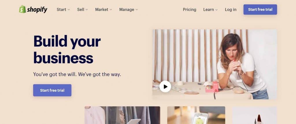
Shopify is one of the leading companies that help users in building online stores without knowing web designing and coding. Let’s take a look at their call-to-action buttons on their website homepage.
They’ve gotten one purple call-to-action on the menu bar and the same above the fold.
Unlike the previous example, both the call-to-action buttons are purple in color and have the exact same text “Start free trial.”
It doesn’t surprise me that they could have two different call-to-action buttons because a lot of companies are making this mistake. However, the color of the CTA buttons does make the buttons stand out.
They could enlarge the second CTA button, and it could definitely perform better. However, they could have highlighted something else through the CTA on the top menu bar.
It does come as a surprise that a company like Shopify isn’t making the most of this opportunity.
The lesson we all can learn from Shopify’s example is that if you got two CTA buttons, you must assign two different functions to them to seize the opportunity. You’ll see that in the next example.
5. SendLoop
Call-to-actions: Signup Free, Let’s Talk

Sendloop is an email marketing service with quite an interesting website design.
If you browse through their website, you’d immediately see two call-to-action buttons side by side on the homepage. The first one says “Signup Free” and the second says “Let’s Talk.”
Their approach to using call-to-action buttons is admirable because they’re using the keyword “free” in the CTA. Also, they’ve gotten a second CTA next to the first one, which takes you to the call scheduling section of the page.
It could further help you book a call with Sendloop.
The important part is that their call-to-action buttons are large, clearly visible, and on point.
The CTA colors are perfectly chosen on the orange background of the website section; the first button is robin egg blue (which is greenish-blue) and the second is white.
The CTA button’s size does impact the clickability because it appeals the visitors to click through when they see it considering other factors are all good.
6. Mailchimp
Call-to-action: Sign Up Free

Mailchimp is one of the most popular email marketing services on the market.
They have a rather simple call-to-action button on their website. It just says “Sign Up Free,” which is understandable because their free plan is quite famous among email marketing starters.
However, they have the same robin egg blue color call-to-action button like many other websites.
The call-to-action could have been a lot better. The color, however, isn’t that prominent and the text is pretty much ordinary.
If they would’ve used a green or sky blue CTA button with a compelling text on it, then it would be fantastic.
Let’s not deviate towards the copy of the homepage because that’s not our topic at the moment, which must have keywords like “email marketing” or “email” to help guide the visitors.
Lastly, the size of the CTA button should have been bigger because of the fact that they have only one call-to-action button above the fold.
7. Stencil
Call-to-action: Start creating images
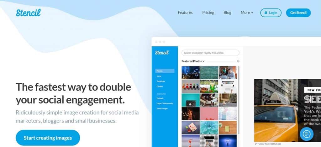
Stencil is a fantastic tool for creating social media images. A lot of bloggers, small businesses, and digital marketers use such tools for designing their Facebook and Instagram posts.
If you look at the above screenshot of Stencil’s homepage, you can see that they have a great website design. Plus, they’ve created their main call-to-action button smartly.
Unlike many other call-to-action buttons, they’ve chosen the right text on their CTA, which says “Start creating images” because it encourages visitors to take action.
Not only does it communicate well, but it also helps visitors understand the purpose of the CTA.
Stencil’s CTA is simple, understandable, and attractive. It goes perfectly with their color scheme and appeals the visitors to click on it.
8. FXhome
Call-to-action: Discover HitFilm Pro
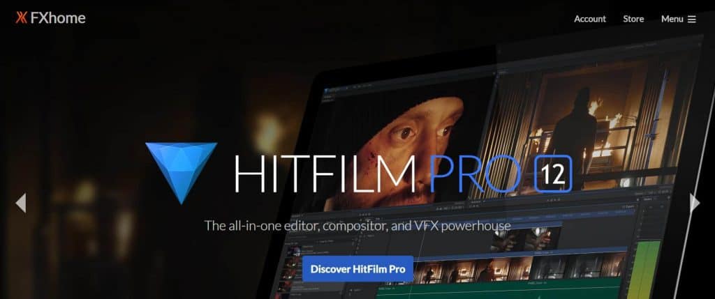
HitFilm Pro is a popular video editing and VFX software from FXhome. They have an attractive call-to-action button. Although it’s not a large CTA button and still manages to capture the attention of the audience.
For instance, the blue color stands out perfectly on a black background layout of the website. Plus, they chose the different text for the CTA from most websites.
The text on the CTA is “Discover HitFilm Pro” which indicates that it would be a details page once we click-through. The good thing about this call-to-action button is that it entices people to move further and find out more about it.
However, the button’s size could have been a little bigger, but it still works fine because of the color selection.
One of the noticeable things is that they chose a navy blue color for their CTA which they have in their software’s logo as well. So it seems like they kept their branding in mind while designing their call-to-action button, which is good.
9. Feedblitz
Call-to-action: Get Started Now

Feedblitz is an email marketing service which helps bloggers, businesses, and marketers manage their email lists and newsletters.
They’ve picked up the trend as far as the color of the call-to-action button is concerned.
Feedblitz also has a robin egg blue CTA button like many other websites.
However, they seem to pull this off because of the certain design elements, for example, they have a faded picture of a woman in office in the background.
There is some text above the CTA. And lastly, they centered the call-to-action button above the fold.
So it looks like that they’ve managed to make a CTA that can work out.
The one thing they could have done better is the text of the CTA. It’s quite mundane like some of the examples we discussed because “Get Started Now” doesn’t involve any emotion, urgency, and benefit for the visitors. Surely, they could have done it better.
10. Cakemail
Call-to-action: Get Started – try it for free
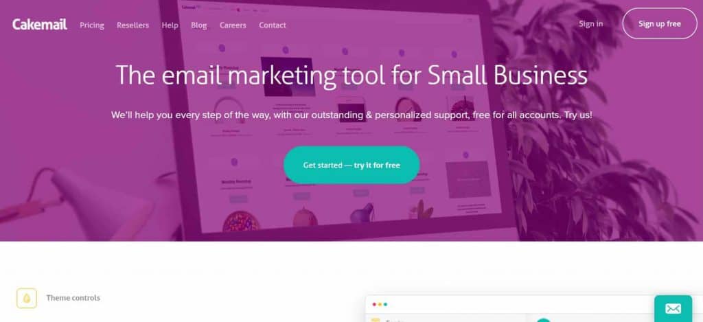
Cakemail is an email marketing tool that caters bloggers, entrepreneurs, and small business for email marketing services. Let’s discuss Cakemail’s call-to-action buttons. They’ve selected the popular color for their CTA, which is becoming quite a thing nowadays. Moreover, their text is simple yet interesting.
Despite the fact that they used both “Get Started” and “Try it for free” keywords together, which seems okay from the visitors’ standpoint. However, they’ve gotten another CTA on the top menu bar, which could be used for highlighting any other website element or page, for example, Live chat or Pricing.
11. Artlist
Call-to-actions: Start Now, Pricing

Artlist is a music subscription service which provides music to the video producers, YouTubers, and vloggers.
They have two call-to-action buttons side by side, and they picked up the yellow color for one of their call-to-action buttons. The best part is that they’ve decided to place two call-to-action buttons, which undoubtedly increases the chance for more engagement.
What they’ve done is that they’re catering both the first-time visitors and the existing visitors who haven’t bought the subscription yet. The first-timers could quickly click-through the “pricing” button and check out the plans, whereas, the existing visitors who already know about the Artlist could start off the buying process through the “Start Now” call-to-action.
The Artlist call-to-action buttons teach us that it doesn’t compulsory to have just a single CTA button. You could have more than one call-to-action buttons to guide through your visitors and convert them into paying customers.
Your Turn
The whole point of this article was to orchestrate various types of call-to-action being used by websites so that a few pearls of wisdom could be shared with you.
You might have noticed that the colors, sizes, and text of the call-to-action buttons were discussed throughout the blog post.
The reason is that the call-to-action buttons and psychology of visitors work hand-in-hand.
The call-to-action buttons influence the actions, behaviors, and conversion rates on the websites all the time. Maybe you have a perfect text on your call-to-action, but the color doesn’t stand out so it’s affecting the conversion rate.
We shared various examples and briefly discussed why some of those CTAs are good and others aren’t.
You might already know that a call-to-action button is key to engagement. Therefore, the purpose of this article was to educate you on increasing your CTR by designing better call-to-action buttons.
Once you finish reading this off, if you go to your website, and scroll through your homepage to see whether or not you have a good call-to-action — that’s the success of this article.
Let’s turn the table around and find out what you can share with us. It could your experience or lesson regarding the call-to-action buttons. So I implore you to answer this:
Has this article somehow helped you understand the use of call-to-action buttons?